BOOTH DESIGN BASICS
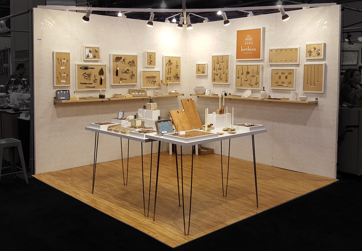
Beehive Handmade's beautiful wholesale booth designed to stay on brand and invite people in. Note the cantilevered lighting bar that eliminates the corner post. For retail, the tables get a skirt to hide inventory.
Photo courtesy of Beehive Handmade.
If the tradeshow is the Ball, the booth is your gown. How you show up reflects directly on the objects you have poured your time and energy into so send them off to the ball with a great looking gown. You don't have to spend a fortune to have a good booth, keeping in mind that it will take you a few shows to fine tune your booth design.
If you are new to tradeshows, take the time to walk the show with a camera and notebook in hand. Take photos (with permission) of the booths that work and write down your thoughts as you walk the aisles.
If you have just finished a show, take a photo of your booth and write down your thoughts on what worked and what didn't. After two or five days of tradeshow brain and convention center food, you won't remember these ideas after you decompress.
The main difference between wholesale and retail booths are the amount of inventory you will need to bring with you. Try to not crowd your booth, you can keep some inventory out of the way and bring it out for customers. If you have a large range of products, consider highlighting a new collection and have a printed catalog to show the rest of your products.
You will probably notice that your eyes glaze over after about 50 booths or so and you will find yourself scanning booths as you try to take in the left and right side of the aisle. Keep this in mind when designing your booth. You are first and foremost designing to answer three questions in 3 seconds:
1. What is it?
Even if what you make is described in your business name, add a banner with a beauty image of your product, especially if you sell small objects like jewelry. Remember, our tradeshow brain gets tired quickly so please make it obvious or I'll walk past your booth.
Whether you have a coveted corner booth or not, approach your booth from various directions. Design to be seen at an angle, not head on.
2. Is this for me?
This is the next question - what kind of jewelry or ceramics or clothing is it?
Does the look/feel/message match my store (retailers) or lifestyle (customer)? You will answer this question not just through images and samples but through your branding (graphics, presentation, staging).
3. Can I get closer?
This sounds like a silly question but it's an important one. People want to check out your work before they commit to walking into your booth. Have items close to the edge of your booth for close inspection. Put on a smile and compliment people in a natural way. People won't engage if you are staring at your phone.
BOOTH LAYOUT
You might have seen various booth layout diagrams on Pinterest. You need to test out what works best for your product and for your booth configuration. Generally you will have about 8' x 8' to work with but can vary in size and positioning (corner or nook). Choose or design display modules that can be arranged in various configurations. After each show write down your observations about which products got the most attention. How did people move and interact with your booth?
Alice Scott, owner of Symbology has a great attitude and a welcoming uncluttered modular booth. The displays show off her work in well considered groupings on various mini platforms that frame the jewelry. She has a few jewelry items over the displays to invite customers in.
10, 5 and 1
Step back from your booth and take a photo to help you see your booth as a whole. Then assess you booth at 10 feet, 5 feet and 1 foot.
AT 10 Feet
Does you booth pass the 3 second test described above? Check your signage, lighting and positioning. Do you have something of interest at various levels. Will passers by still be able to see what you are selling if there are a few people standing in front?
AT 5 Feet
Check our lighting for dark spots. Can you see postcards, samples and more information about what you sell? Your ideal customers will want to see your collections or groupings clearly enough to get a sense of wether or not this fits their style.
AT 1 Foot
God is in the details (or the devil - depending on who you ask). Be ready for up close inspection. Displays should be neat and fresh, prices clearly displayed and postcards or business cards easy to find.
DISPLAYS
Use the skills you already have to create a memorable booth. If you work in wood or metal, use your skills to create original displays. Dedicate the same level of attention and craftsmanship to your displays and you will stand out.
Laser cut displays designed by Spark Metal Studio for their laser cut jewelry.
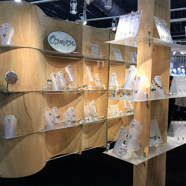
A very original use of flexible plywood to create an environment and maximize vertical display area from Osmose.
Smart displays for Queens Metal earrings.
BANNERS
We love fabric banners. They are durable, fold down easily and can be ironed with a small travel steam iron. The print quality has increased in recent years making them a great choice for trade show booths. Fabric banners are a good choice when flying to a show.
Johanna Brierley's set of four banners looks great.
A bold statement for bold Queens Metal Jewelry.
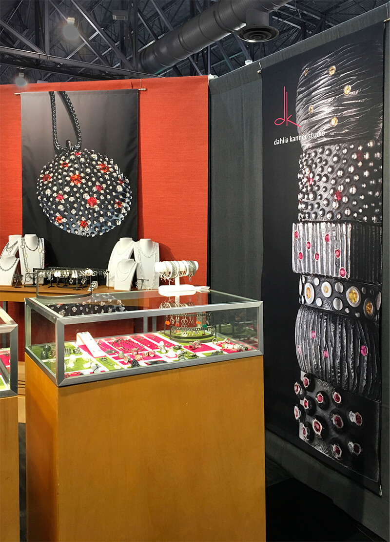
Macro photography on Dahlia Kanner's banners showcase the textured jewelry she is known for.
WALLS, SHELVES AND LIGHTING
Always invest in good photography and good lighting, especially if you sell glass or jewelry. Good lighting can make the difference between products that sing and products that seem old and tired.
Some artists invest in sturdy displays particularly if trade shows are a primary source of income. Glass and jewelry need multiple sources or lighting to create that special sparkle. Shelves can establish visual space between pieces and create vignettes so customers can imagine these items in their home.
The examples below show two glass artists with booths that invite you in.
Vitrix invites you into their booth with a gentle curve and great lighting.
Theo Keller makes good use of his corner booth and invites people to take a closer look by putting his work at eye level.
STAGING
Give the eyes areas to focus attention, and areas to rest. Erica Bello plays off the geometric forms in her jewelry to create a display full of small scenes to explore her designs.
Erica Bello creates a landscape that complements her geometric designs.
FOLLOW UP
Tradeshows aren't an island of sales. They are a great way to connect with your ideal stores and customers. Most will not be ready to buy at the show. Many need to get to know you first, so have a plan to follow up with customers who weren't ready to buy but liked your work. . Capture emails, write down the model number, size, color and price of the item they were interested in on the back of one of your postcards.
WHAT NOT TO DO
Remember it takes 3 seconds for someone to decide if they should stop or not. This is the main difference between a small craft fair and a large show. You can comfortably visit 50 booths in an afternoon. ACC Baltimore had 724 artists during their retail days and ACRE had 552 artists.
1. Choose fabrics that travel well and won't draw too much attention away from your work. You want the eye to travel to the work not the decorations.
2. Don't overcrowd your booth. Leave some space for the eyes to rest and focus on what's important. When in doubt stay minimal.
3. Keep your tools behind the wall, curtain or in a drawer. Channel Marie Kondo and bring the joy your work deserves.
Connect with us if you would like to talk about your booth design, banners, line sheets, catalogs, photography or any other ways to free up your time so you can focus on making awesome things.


