Rancatore’s
PRINT | ENVIRONMENTAL | OUTREACH
________________________________
rancatore's artisanal ice cream | A FRESH AND MEMORABLE IDENTITY
Joe needed a new identity for his ice cream store. He wanted to reflect the cool atmosphere at his store. He knew the high school kids who are often both staff and faithful clients, called the store "Ranc's". Joe embraced the nickname and used it in his packaging.
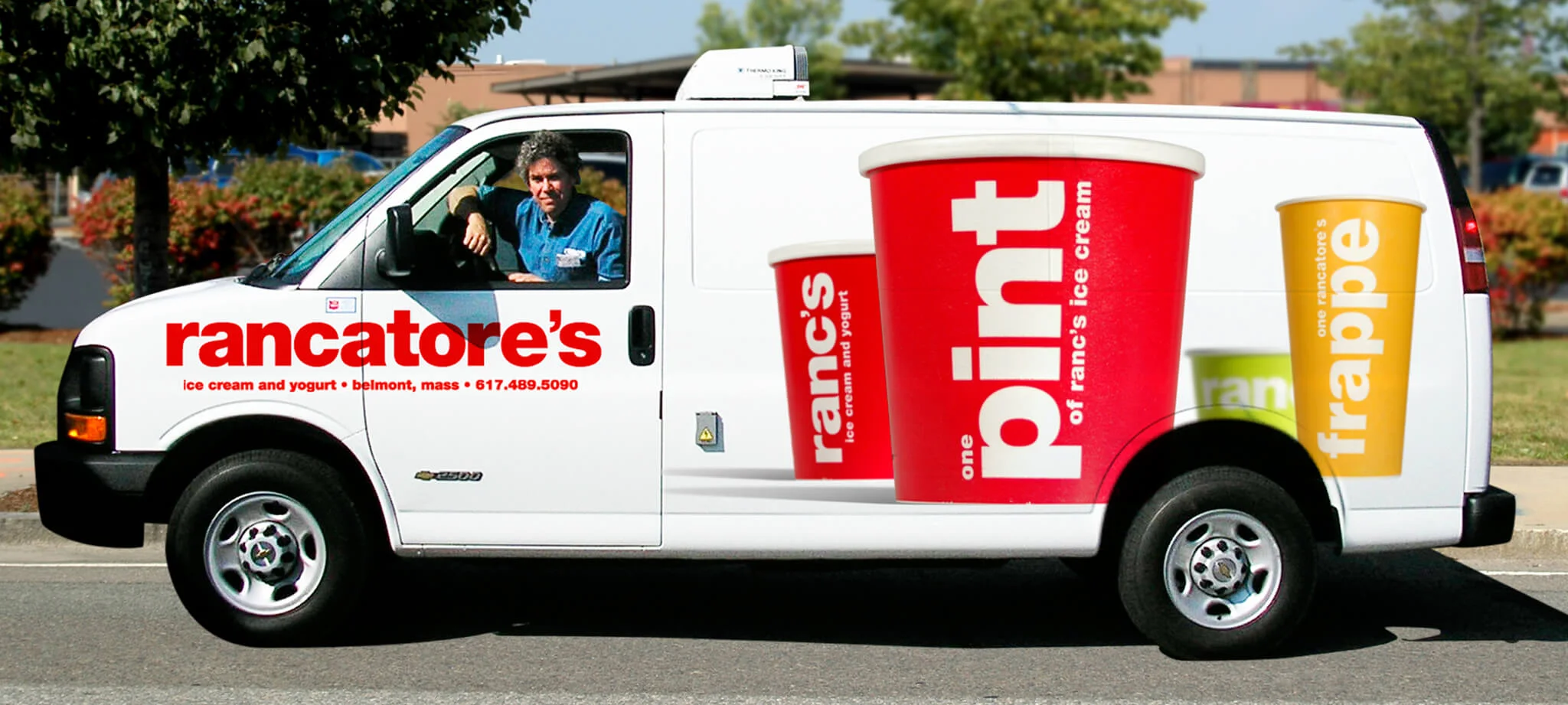
Chris didn't stop at the logo. He knew about Chris' background in exhibit design and tapped into it to design all the interior and exterior signage for his three stores. We are still hoping to someday have a Ranc's closer to us. Oh, and if you see his van, honk twice!!
“Chris was critical in developing the branding of Rancatore’s ice cream and yogurt. Chris was hired to help with one project, and became the graphic designer for ALL things Rancatore’s.
From designing our pints and cup designs, to signage, stationary, and web site, Chris developed the branding of the company with outside the box thinking.”
Rancatore's Ice Cream
Photo Credit: Instagram @Rancatores
Branding | Rancatore's T-Shirts
These T-shirts are fun and come in various color combinations. The most coveted ones are the Staff T-shirts.
Photo Credit: Instagram @BlkMagicCoffee
PACKAGING DESIGN
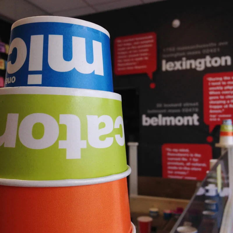
These containers are designed to make you smile and to be instantly recognized as Ranc's Ice Cream from across the street.
Graphic Design | Business Cards
Eye catching business cards are great for a fun and playful brand.
environment | exterior signage
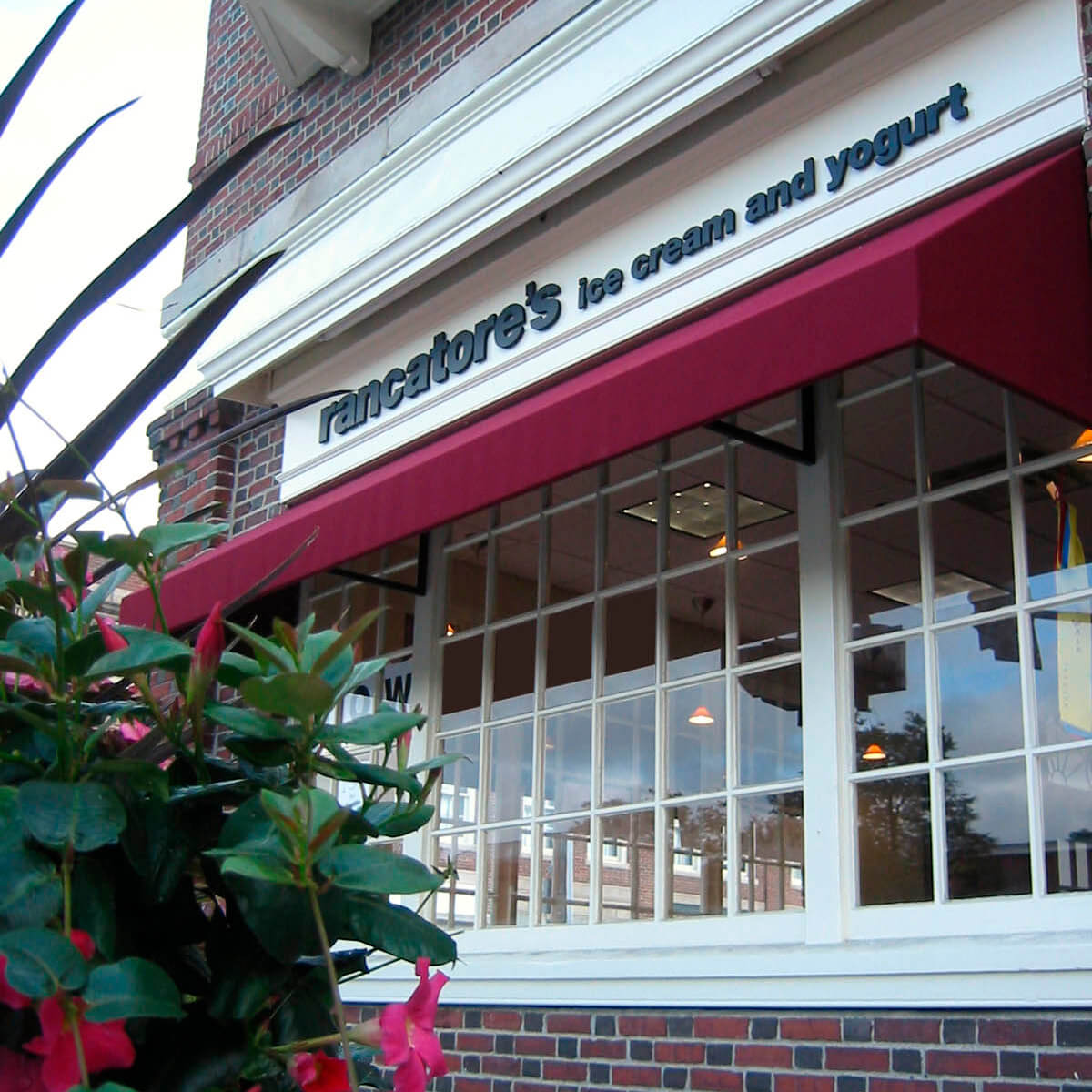
The town of Lexington, MA has specific guidelines for exterior signage. Chris made sure the new exterior sign and awning met those requirements. His experience in exhibit design was valuable when finding the right vendor to fabricate and install the awnings.
environment | menu board
Joe is constantly experimenting with new flavors and if you check out rancs.com, you will see online menus that update hourly. Chris designed a menu board that would look good no matter who updated it.
ENVIRONMENT AND SIGNAGE | POP UP SHOP
Chris designed all the graphics for Ranc's Spring of 2016 pop up shop. Identity is not just for business cards and packages. It can create a cohesive branded environment when you extend the design to every aspect of your business. The bathroom signs reflect Ranc's playful brand.
An important part of Joe's mission is to not just serve but also to support the community. If you look at the wall paper you might recognize a map of Boston and its suburbs.
A subtle and fun reminder of what Ranc's is about.
